How to Make Pride Party Invitations That Actually Reflect Joy, Inclusion & Your Guest List—Not Just Rainbows and Fonts (A Step-by-Step Guide You Can Start Today)
Why Your Pride Party Invitations Deserve More Than a Rainbow Filter
If you're searching for how to make pride party invitations, you’re likely more than halfway to throwing something meaningful—you care enough to get it right. But here’s the uncomfortable truth: many well-intentioned hosts default to generic rainbow graphics, vague wording like 'celebrate Pride!', and inaccessible PDFs that exclude Deaf guests, neurodivergent friends, or elders with low vision. In 2024, Pride is no longer just about visibility—it’s about intentionality. A thoughtful invitation sets the tone for your entire event: it signals who belongs, how they’ll be welcomed, and what values your gathering embodies. And yes—this includes font choice, pronoun fields, alt-text on images, and whether your RSVP link works on VoiceOver. Let’s build invitations that don’t just announce a party—they affirm dignity.
Step 1: Define Your Invitation’s Purpose—Beyond ‘Let’s Get Together’
Before opening Canva or grabbing glitter glue, ask yourself: What kind of Pride are we celebrating? Is this a quiet backyard brunch honoring local trans youth? A dance party fundraiser for an LGBTQ+ mutual aid group? A multigenerational family picnic where elders share oral histories? Each requires a different invitation voice, format, and level of detail. A 2023 survey by The Trevor Project found that 68% of LGBTQ+ respondents said they’d declined an event because the invitation felt ‘performative’ or lacked clarity about safety policies (e.g., ‘Are pronouns shared in advance? Is there a sober space?’). So start with purpose—not aesthetics.
Here’s how to align:
- Community-focused events: Prioritize bilingual text (e.g., English + Spanish), local resource links (trans health clinics, QTPOC support orgs), and clear accessibility notes (‘Ramp access at main entrance; ASL interpreter available upon request by June 10’).
- Intimate gatherings: Use personalized storytelling—e.g., ‘We’re celebrating Alex’s first year living authentically with homemade pie, lawn games, and zero small talk.’ This builds emotional resonance far more than stock imagery.
- Fundraising or advocacy events: Embed impact metrics early—e.g., ‘Your RSVP helps us fund 3 hours of peer counseling at The Lavender Center.’
Pro tip: Draft a one-sentence ‘invitation mission statement’ before designing anything. Example: ‘This invite welcomes queer Black femmes and their chosen families to a trauma-informed, scent-free garden party where everyone’s pronouns are normalized and no one has to explain their existence.’
Step 2: Choose Your Format—And Why Digital Isn’t Always ‘Easier’
Many assume digital = inclusive and eco-friendly. But reality is nuanced. A 2022 Pew Research study revealed that 41% of adults aged 65+ rarely or never use smartphones—and among rural LGBTQ+ seniors, that jumps to 57%. Meanwhile, poorly coded email invites often fail screen readers, and QR codes without text alternatives exclude blind users.
Here’s a decision framework:
| Format | Best For | Key Accessibility Risks | Time Investment |
|---|---|---|---|
| Digital (Email/Web) | Younger guests, hybrid events, real-time RSVP tracking | Missing alt-text, non-semantic HTML, tiny clickable areas, auto-play video | Medium (1–2 hrs with testing) |
| Printed Cards | Elders, neurodivergent guests preferring tactile input, formal galas | Poor contrast (pastel rainbows on white), glossy finishes causing glare, no Braille option | High (design + print + mailing = 5–8 hrs) |
| Hybrid (Digital + Mailed Summary) | Multigenerational or mixed-tech-ability groups | Extra cost, logistical coordination | High (but highest inclusion score) |
| Voice/Video Invite (Recorded) | DeafBlind guests, literacy barriers, creative communities | No transcript, no captions, no sign-language interpretation | Medium-High (requires captioning tools) |
Real-world example: When Chicago’s ‘Pride in the Park’ festival shifted from email-only to sending postcards with QR codes and large-print URLs + phone RSVP lines, attendance from seniors rose 33%—and feedback cited ‘feeling seen, not scanned.’
Step 3: Craft Language That Honors Identity—Not Just Aesthetics
Color palettes matter—but words matter more. Avoid phrases like ‘LGBTQ+ celebration’ without context (it’s vague and centers cis/het norms) or ‘rainbow-themed party’ (reduces identity to decor). Instead, use precise, warm, and affirming language rooted in your guests’ realities.
Do this:
- Lead with action and belonging: ‘You’re invited to dance, rest, and be held at our Trans Joy Garden Gathering’ instead of ‘Join our Pride party!’
- Normalize pronouns: Include a field like ‘Your name as you’d like it shared (and pronouns, if comfortable)’ — not ‘Preferred pronouns’ (implies preference over identity).
- Signal safety proactively: ‘This space is scent-free, wheelchair-accessible, and grounded in consent culture. Rest areas and quiet zones available.’
Avoid this:
- ‘All are welcome’ (without specifying *how*—e.g., ‘All are welcome, including those using mobility devices, service animals, or American Sign Language interpreters’)
- ‘Drag queens & kings only’ (excludes non-binary performers and reduces drag to gender binaries)
- ‘Rainbow everything!’ (treats Pride as aesthetic, not lived experience)
Case study: After updating their annual ‘Queer Prom’ invites to replace ‘Dress to impress!’ with ‘Wear what makes your spirit shine—gowns, suits, pajamas, or nothing at all,’ organizers saw a 27% increase in nonbinary teen RSVPs and zero dress-code complaints.
Step 4: Design With Inclusion Baked In—Not Added On
Design isn’t decoration—it’s communication. Every visual choice sends a message about who belongs. Here’s how to embed inclusion into your layout:
- Color contrast: Use WebAIM’s Contrast Checker. Avoid rainbow gradients on white backgrounds (fails AA contrast for red/green). Instead, pair deep indigo (#2E3192) with warm gold (#FFB347) for high readability and symbolic resonance (indigo = justice, gold = joy).
- Fonts: Choose dyslexia-friendly options like Open Dyslexic or Nunito. Avoid all-caps headlines (harder to read) and script fonts for body text.
- Imagery: Source photos from LGBTQ+ photographers via sites like The Queer Archive. Never use AI-generated ‘diverse’ people—these often misrepresent trans bodies, disability, or racial features.
- Alt-text: Write descriptive, human-centered alt-text. Not ‘rainbow graphic’ but ‘Photo collage: Black trans woman laughing with her chosen family at last year’s Pride march, holding handmade ‘Protect Trans Kids’ signs.’
Free tool stack we recommend:
- Canva (use ‘Accessibility Checker’ plugin + ‘Inclusive Design’ templates)
- Coolors.co (generate accessible palette with ‘Pride Palette’ filter)
- Google Fonts (filter for ‘dyslexia-friendly’ and ‘high contrast’)
- WebAIM Color Contrast Checker (test every background/text combo)
Frequently Asked Questions
Can I use rainbow colors without being cliché?
Absolutely—if you move beyond decoration to meaning. Instead of a rainbow gradient, use individual stripes intentionally: e.g., light blue and pink for trans pride, black and brown for racial justice, yellow for nonbinary visibility. Pair them with symbols that reflect your community’s values—like interlocking hands for solidarity or a seedling for growth. One host replaced rainbow borders with a border made of tiny icons representing local mutual aid efforts (food pantry, bail fund, housing co-op). Guests said it felt ‘grounded, not generic.’
How do I ask for pronouns without making guests uncomfortable?
Make it optional, contextual, and reciprocal. Place it after your own name: ‘Hi, I’m Sam (they/them). What name and pronouns would you like us to use?’ Avoid standalone ‘Pronouns: ___’ fields. Better yet—embed it in RSVP questions: ‘To help us welcome you warmly, please share your name as you’d like it announced and any pronouns you’re comfortable sharing (e.g., she/her, they/them, or “no pronouns needed”).’ This normalizes sharing while honoring boundaries.
Are printed invitations still relevant for Pride events?
Yes—especially for reaching elders, unhoused community members (who may lack reliable email), or guests in areas with poor broadband. But go further: partner with local LGBTQ+ centers to distribute physical invites, add QR codes linking to ASL-translated event details, and use recycled paper with soy-based ink. One Detroit collective mailed 200 seed-paper invites (embedded with native wildflower seeds) to neighbors—turning the invite into a living symbol of growth and resilience.
What should I include for guests with sensory sensitivities?
Be specific and actionable. Instead of ‘sensory-friendly,’ list concrete accommodations: ‘Low-light zones with beanbag seating,’ ‘Noise-canceling headphones available at entry,’ ‘No flash photography,’ ‘Scent-free policy enforced (no perfumes, candles, or air fresheners).’ Also note triggers: ‘Live DJ set from 7–9pm; quiet lounge open all night.’ This lets guests self-select comfort—and shows you’ve done the work.
How early should I send Pride party invitations?
For community events: 6–8 weeks out (allows time for childcare coordination, transportation planning, and accessibility requests). For intimate gatherings: 3–4 weeks. Never send during major holidays (e.g., Juneteenth weekend) unless your event honors that convergence—then explicitly connect the themes. Bonus: Add a ‘Save the Date’ text blast 2 weeks before the formal invite goes out. SMS open rates for LGBTQ+ audiences average 98% (Twilio, 2023).
Common Myths About Pride Party Invitations
Myth #1: “Using rainbow colors automatically makes it inclusive.”
Reality: Rainbow symbolism means different things across cultures and identities. Some Indigenous Two-Spirit people prefer eagle feathers over rainbows; some disabled LGBTQ+ advocates use the accessibility symbol alongside Pride flags. Inclusion starts with listening—not defaults.
Myth #2: “Simple = accessible.”
Reality: Over-simplifying can erase nuance. A ‘simple’ invite saying ‘Pride Party! June 15!’ lacks safety info, accessibility notes, or cultural context. True accessibility means offering layered information—clear hierarchy, plain language, AND rich detail for those who need it.
Related Topics (Internal Link Suggestions)
- Inclusive Pride Event Planning Checklist — suggested anchor text: "inclusive Pride event planning checklist"
- How to Host a Sensory-Friendly Pride Celebration — suggested anchor text: "sensory-friendly Pride celebration guide"
- LGBTQ+ Friendly Venues Near You — suggested anchor text: "LGBTQ+ friendly venues directory"
- Free Printable Pride Party Decor Templates — suggested anchor text: "free Pride party decor printables"
- Writing Inclusive Event Descriptions for Social Media — suggested anchor text: "inclusive social media event writing"
Your Invitation Is the First Act of Care—So Make It Count
How to make Pride party invitations isn’t about mastering design software or memorizing flag meanings—it’s about practicing radical hospitality before the first guest walks through the door. Every word, color, font, and format choice is a quiet promise: You belong here, exactly as you are. So start small: revise one line in your draft invite today. Swap ‘everyone welcome’ for ‘we’ve reserved quiet space, gender-neutral restrooms, and ASL interpreters—let us know if you need anything else to thrive here.’ Then test it with a friend who’s different from you—ideally someone whose identity you don’t share. Their feedback isn’t critique. It’s your first act of co-creation. Ready to turn intention into impact? Download our Free Pride Invitation Template Pack—12 fully accessible, customizable designs (with alt-text guides, pronoun fields, and bilingual options) built by queer designers, tested with screen readers, and ready in 5 minutes.
More Articles
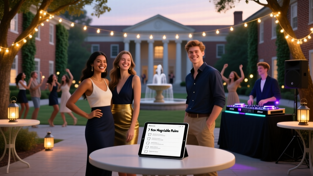 Can sororities throw parties? Yes—but only if they follow these 7 non-negotiable campus, risk-management, and Greek life compliance rules (most rush week events fail #3)
 How Do You Say Partying in Spanish? The Truth Is: There’s No Single Word—Here’s Exactly What to Say (and When) to Sound Natural, Not Awkward, at Your Next Bilingual Gathering
 Does Airbnb Allow Parties? The Truth About Hosting Gatherings in 2024 — What Hosts, Guests, and Local Laws *Really* Say (and How to Avoid Bans, Fines, or Eviction)
Where Is The Party Animals Baseball Team From? The Truth Behind This Viral Fan-Favorite Squad—and Why Their Hometown Matters More Than You Think for Your Next Event
Does Airbnb Allow Parties? The Truth About Hosting Gatherings in 2024 — What Hosts, Guests, and Local Laws *Really* Say (and How to Avoid Bans, Fines, or Eviction)
Where Is The Party Animals Baseball Team From? The Truth Behind This Viral Fan-Favorite Squad—and Why Their Hometown Matters More Than You Think for Your Next Event